
How I spent my summer vacation:
One weekend I'm in London, another weekend I'm in Croatia, another weekend I'm South Carolina, and yet another weekend was spent in my living room, staring at my collection of NFL miniature helmets and deciding which ones I like best.
The main criteria used in the judging were...
- Creativity/Uniqueness- Anybody can stick an animal's head on the side of their helmet. I want to see who does things a little bit differently.
-Color scheme- Obviously a great helmet needs to have some superficial aesthetic appeal.
- How the helmet looks when paired with the rest of the team's uniform.
- Past versions of the helmet- Has this design been improved over time? Did they ditch a great past design for an inferior replacement?
- Team history/Connection to the city- This is increasingly rare, but teams like the Steelers, Saints, and Cowboys do this aspect especially well.
With nothing more needed to be said, I present Bromothymol's official NFL helmet rankings for the 2014 season.
1. Steelers

What's to Like:
- Awesome story behind the logo, with a real connection to the city of Pittsburgh. The multi-colored diamonds are based on the Steelmark logo that was originally created by US Steel. The best NFL nicknames/logos are ones with this sort of connection to their home.
- The Blank Side- Pittsburgh is the only team in the NFL to have their logo on only one side of the helmet. This not only creates a pretty cool all black effect when the players are facing the left, but it is also a subtle but significant point for uniqueness.
-"Steelers" on side- Pittsburgh is one of three teams that have their nickname spelled out in the helmet logo. The Raiders do this unnecessarily, but for the Steelers it's actually a nice touch since otherwise you'd have no clue what the logo is supposed to be. In another cool little piece of trivia, it actually used to just say "Steel" in this spot, which is kind of weird but cool to see in old pictures, like the Hollywood sign back when it read HOLLYWOODLAND.
2. Redskins

What's to Like:
- Enjoy this helmet while you still can, because with each passing day, it looks more and more likely that it will be banned in the near future.
-The color scheme on these helmets is flawless, and the maroon reminds me of raspberry Tootsie Pops. How many other teams can say that their helmet looks like it tastes good?-As we'll see later on on this list, the color of the face mask can make or break the helmet, and far too many teams screw this up. Not the Redskins though, the gold mask complements the maroon perfectly.
-At the risk of being offensive, I'll go ahead and say it, the logo is really cool. Plus, if they are forced to change logos, they could easily re-work this one to be RG3's face in side profile view and it would still look pretty good.
3. Bengals

What's to Like:
- The Bengals took what used to be a really crappy helmet design and improved on it greatly.
- I applaud the risk taking. Trying to add a visual effect like tiger stripes is pretty hit-or-miss. They not only took the risk, but it works big time.
- One of the few truly unique helmets in the NFL. I'm also a firm believer that college and pro sports just don't have enough orange and black color schemes.
-Helmet color matches that of the starting quarterback's hair. I can't begin to tell you how rare that is.
4. Colts

What's to Like:
-The Colts scored big on simple improvements made over time, as they went through some growing pains on earlier editions. Putting the horseshoes on the back was a terrible idea,as was the blue helmet with white horseshoes. Simply shifting them to the sides and flipping colors was all it took to right the ship, a solution that's held up for nearly 60 years now.
-Classic logo, made even better by the fact that it kind of makes sense, but not really when held up to closer scrutiny (Sure, they're the Colts, and horseshoes are a symbol for good luck, but this logo still looks like a U more than anything. The Colts shouldn't be represented by a U any more than the Miami 'Canes, but both are great logos).
-Having either white helmets or gray face masks usually means fashion suicide, but the Colts somehow get away with both.
5. Cowboys

What's to Like:
-I grew up hating the Cowboys, but you simply can't argue with the silver/blue/white color scheme, and the sleekness to this helmet that will never go out of style.
-It baffles me that Jerry Jones sends them out wear those gross alternate throwback jerseys with the white helmet and blue star so often.
- The word 'iconic' gets thrown around far too often these days, but this is a legitimately iconic helmet.
6. Browns- Everything about the Browns helmet defies explanation, which is exactly what makes it great. It's like the old flag of Libya.

What's to Like:
- When the Browns made their triumphant return to the league in 2002, they had every reason to update their logo and helmet design. For some reason, they didn't. Monochromatic orange all the way baby.
- For some reason, these helmets aren't plain BROWN (which would vault them into the top 3 of this list).
- The Cleveland Browns logo is a plain orange football helmet.
- For some reason, guys with dreadlocks look awesome wearing these helmets.
- For some reason, Lil Bow Wow is wearing a Tim Couch jersey on the cover of his 2000 "Beware of Dog" album. It wasn't until very recently that I realized: that's not a Tim Couch jersey, Bow Wow had the foresight to pick up a FUTURE Johnny Manziel jersey!
7. 49ers

What's to Like:
-Here's an example of the sum being far greater than its parts. No helmet goes better with its jersey counterpart than this one and San Fran's red home jerseys.
- Does anyone else remember that 49ers jacket that Danny Tanner used to sometimes wear on Full House? In tennis, they refer to that as "too good".
- In 1991, the team tried to introduce a new helmet design, but quickly scrapped the idea when this was the best they could come up with. Imagine Joe Montana wearing that.
8. Saints

What's to Like:
- The Saints and 49ers helmets are essentially the same thing, a dark gold with a basic side logo. 49ers get the edge due to the rest of their uniforms.
- In 1969, the team tried out black helmets with a gold fleur-de-lis during the preseason, but ultimately changed back to the color scheme that still holds up today. After taking a look at some artist renderings of what an updated version of those black helmets might look like, my conclusion is that making the switch would move them into the top 5, and possibly higher.
9. Bears

What's to Like:
-It used to really annoy me just how sleek Chicago's helmets are. No stripe down the middle, a navy blue that's so dark that it looks black most of the time, and a very pointy C. Over time, I've come to appreciate them for their cleanliness and sophistication.
-I'll also say that on a sunny day, there's no helmet that glistens quite like this one.
-I've seen a lot of fonts in my day, but none of them pull off the C quite like whatever font that is.
10. Raiders

What's Pretty Good Overall, With a Minor Grievance Here and There:
- Coolness-wise, it's hard to go wrong with a silver helmet. Plenty of teams find a way, as we'll see later on, but the Raiders mostly stick to the script and end up with a result they can be proud of.
- The man on the logo looks like he's probably an unspeakably terrible person, which I believe is the effect the designers were going for. The guy won't even open up his one good eye for the sake of being photographed. He's either drunk and passed out on the deck of a ship that he acquired through questionable means, or he's purposely being an asshole to the photographer.
- "Raiders" spelled out in the logo shield is unnecessary. We already know that unpleasant fellow is a Raider. He couldn't possibly be anything else.
11. Chiefs
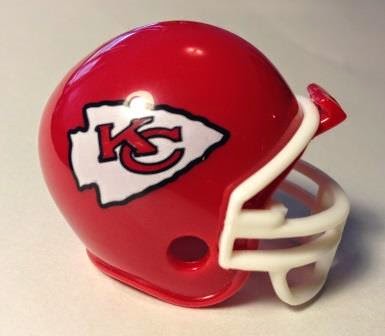
What's Escaping Scrutiny from the NFL, Unlike Its Native Counterpart in Washington:
- Until the Buffalo Bills get their act together, this is the only red helmet in the NFL.
- Nothing really stands out about this design, but it's aesthetically pleasing all the same. As I once heard a roller coaster enthusiast at Cedar Point comment about the Gemini, "You know it's nice. It doesn't try to be something it's not."
12. Panthers

What's to Like:
- Absolutely a product of their time, these helmets practically scream, 1995!!!
- The similarity between the Panthers uniforms and the Playmakers from the ESPN original series back in the day.
- They've now made it to their 20th season without any changes; it may not be the world's greatest design, but it's good enough, and I can appreciate the continuity.
13. Lions

I Have So Many Problems With This:
- There is literally no chance that I would ever rank Bromo's helmets lower than 16, so ranking them this low is telling of my frustrations with the design.
- They took a classic design that was nearly perfect and with only a few small changes, have butchered beyond any semblance of decency.

- We have an easy Top 3 helmet in the NFL, if not higher.
- Logo is simple and easy on the eyes, the blue face mask is a perfect complement to the silver.

-They can wear the 1934 throwbacks every game, every season, as far as I'm concerned. The plain silver helmets, silver pants, and silver jersey numbers are better than anything that at least 90% of the NFL has come up with at any time before or after.
Instead they chose Door #3, which apparently was "replace the Honolulu blue stripes going down the top with some ugly black ones, add a bunch of ugly and unnecessary lines to the lion silhouette, and throw on a horrible black face mask for good measure."
14 and 15. Giants and Jets


If You Can Be Boring There, You Can Be Boring Anywhere:
- Safe, uninspired, decent looking, there's nothing particularly right or wrong with the helmets of either New York team.
- Both of them look like they're not quite sure which era they're trying to evoke; each have somewhat of a throwback feel to them, but not exactly.
- The Giants do have a great shade of blue going for them. As a kid, I liked the GIANTS on the side instead of NY, but looking back, that doesn't really look right either.
- I'd like to see the Jets do a better job of incorporating a jet, but that hasn't gone well in previous attempts.
- I suppose I would have expected the suits on Madison Avenue to try a little bit harder on these.
16. Dolphins

What's to Feel Conflicted About:
- In the Dan Marino days, the Dolphins were my 2nd favorite team, solely because I liked the helmets and the turquoise/orange jerseys.
- Over the years, this helmet keeps getting small tweaks that I like less and less each time.
- My replica mini helmet collection isn't up to date anymore, as the Dolphins made the puzzling decision to take off the helmet of the dolphin that's on their helmet. It's still the basically the same thing, but it looks all weird now. It's like seeing Mickey Mouse without pants. This article at New Republic does a much better job than I could of explaining the strangeness of this change. As for me, I'm keeping the Dolphins just barely in the top half for now.
No comments:
Post a Comment